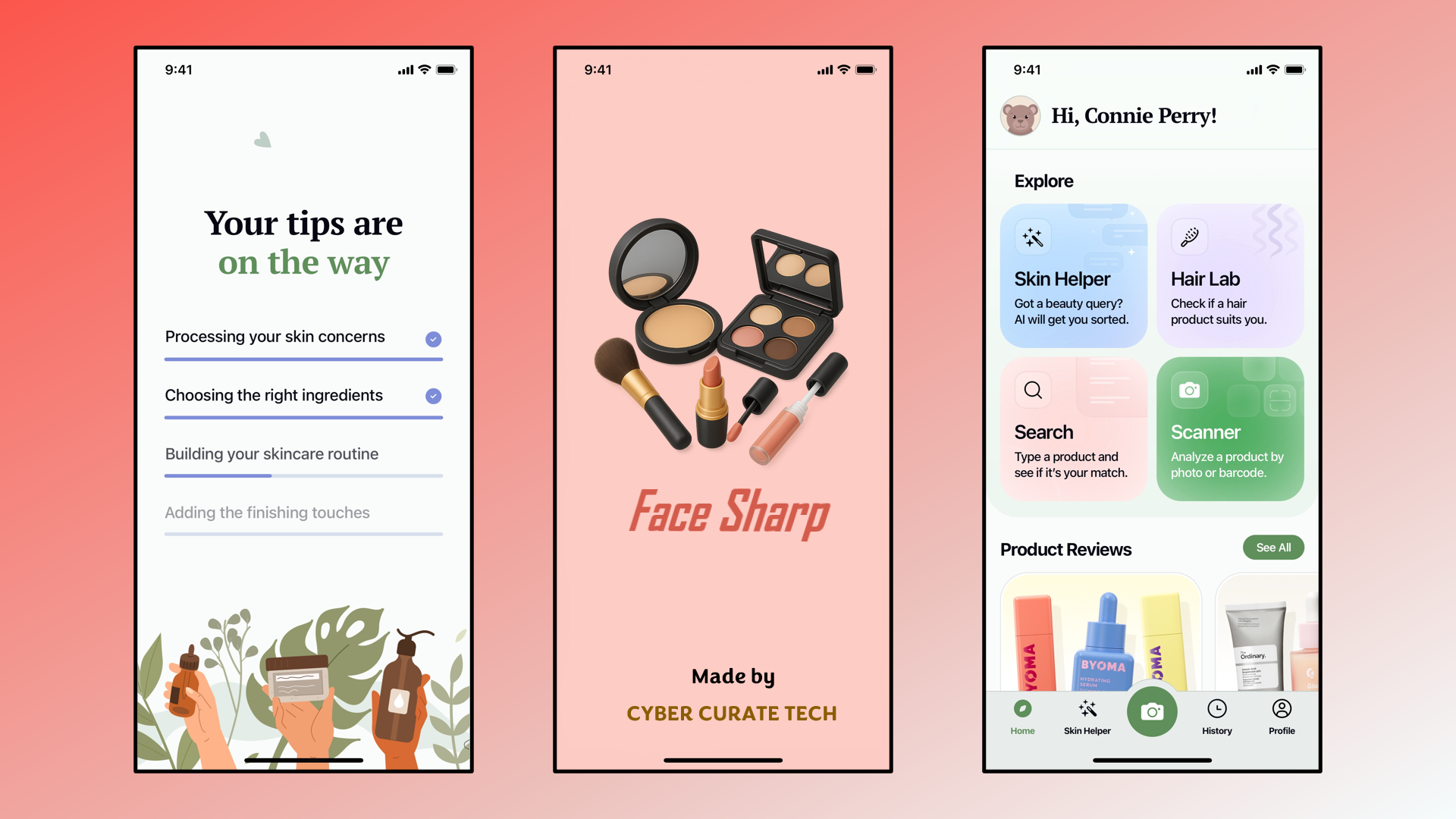
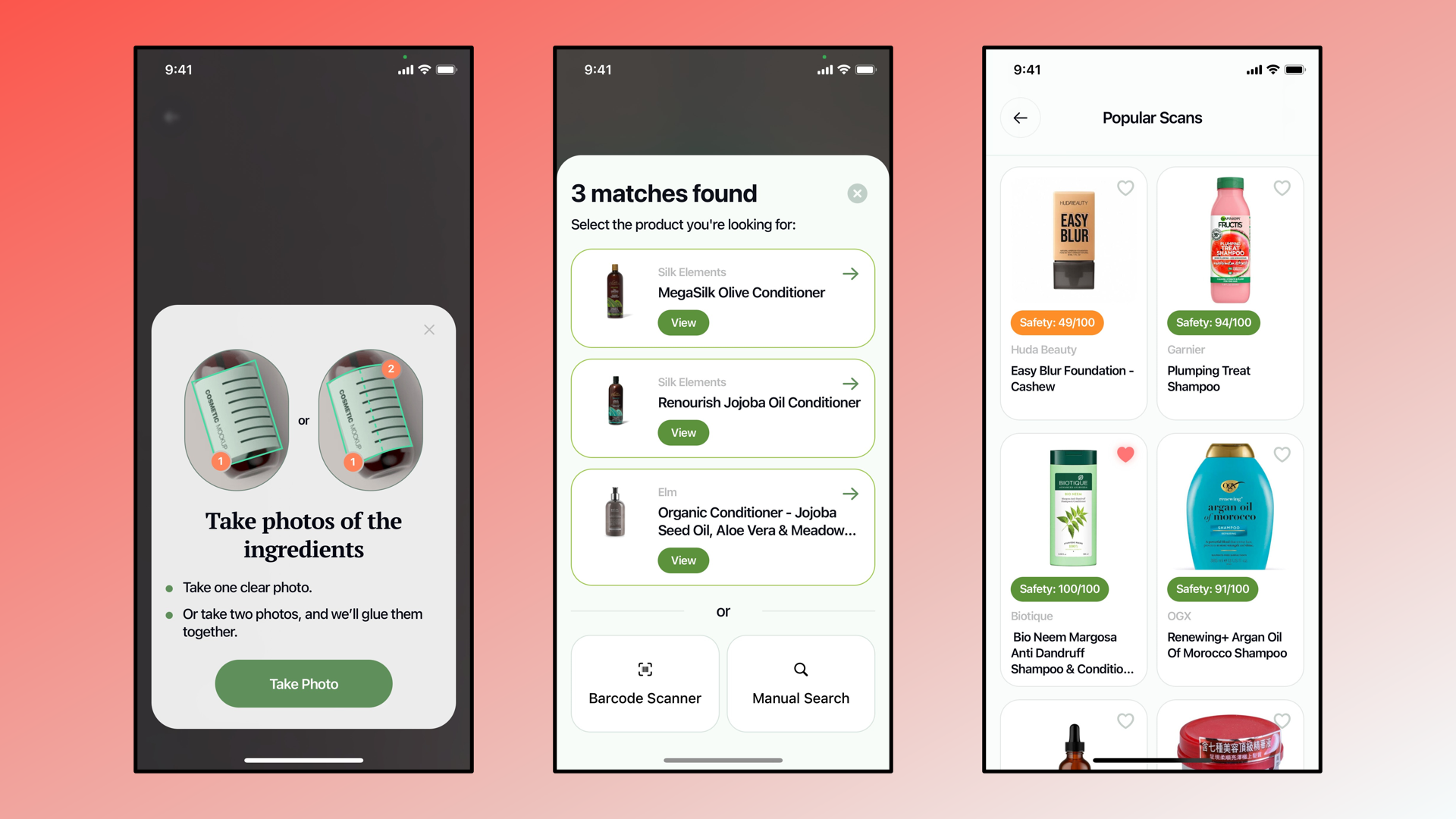
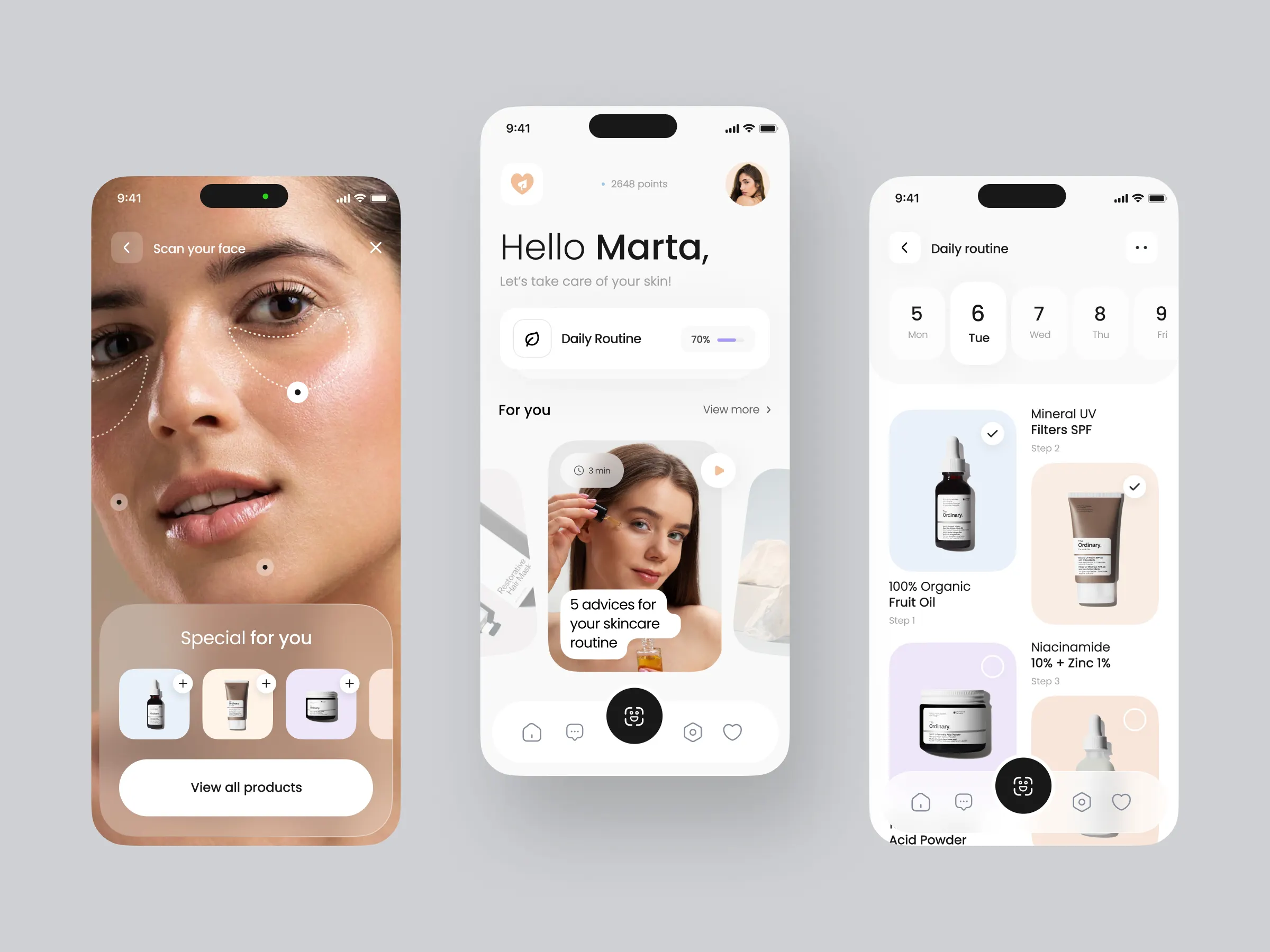
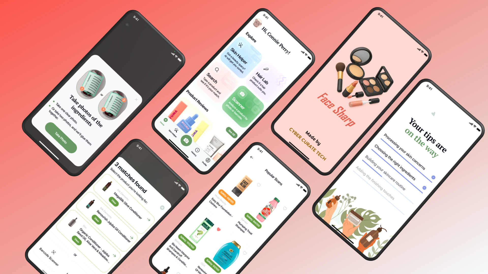
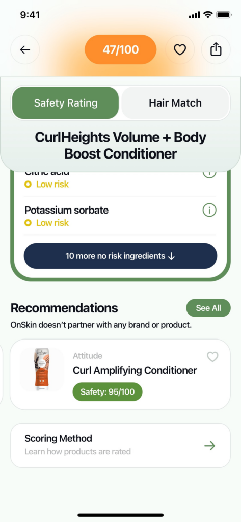
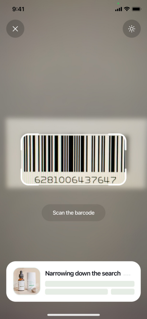
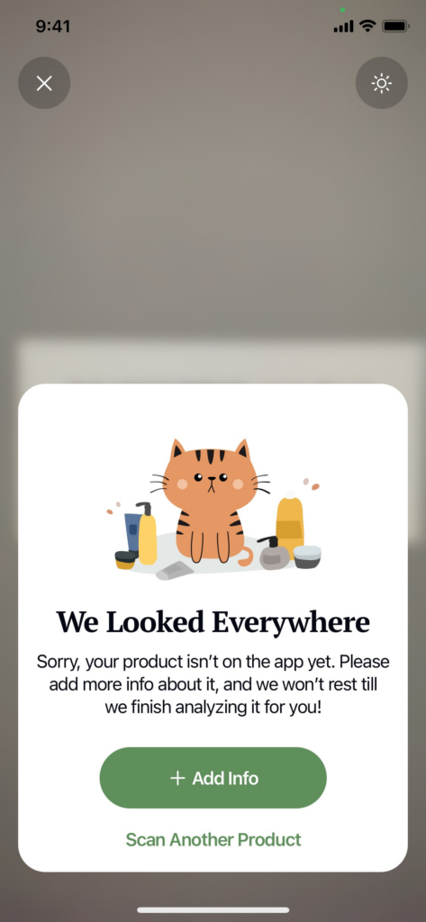
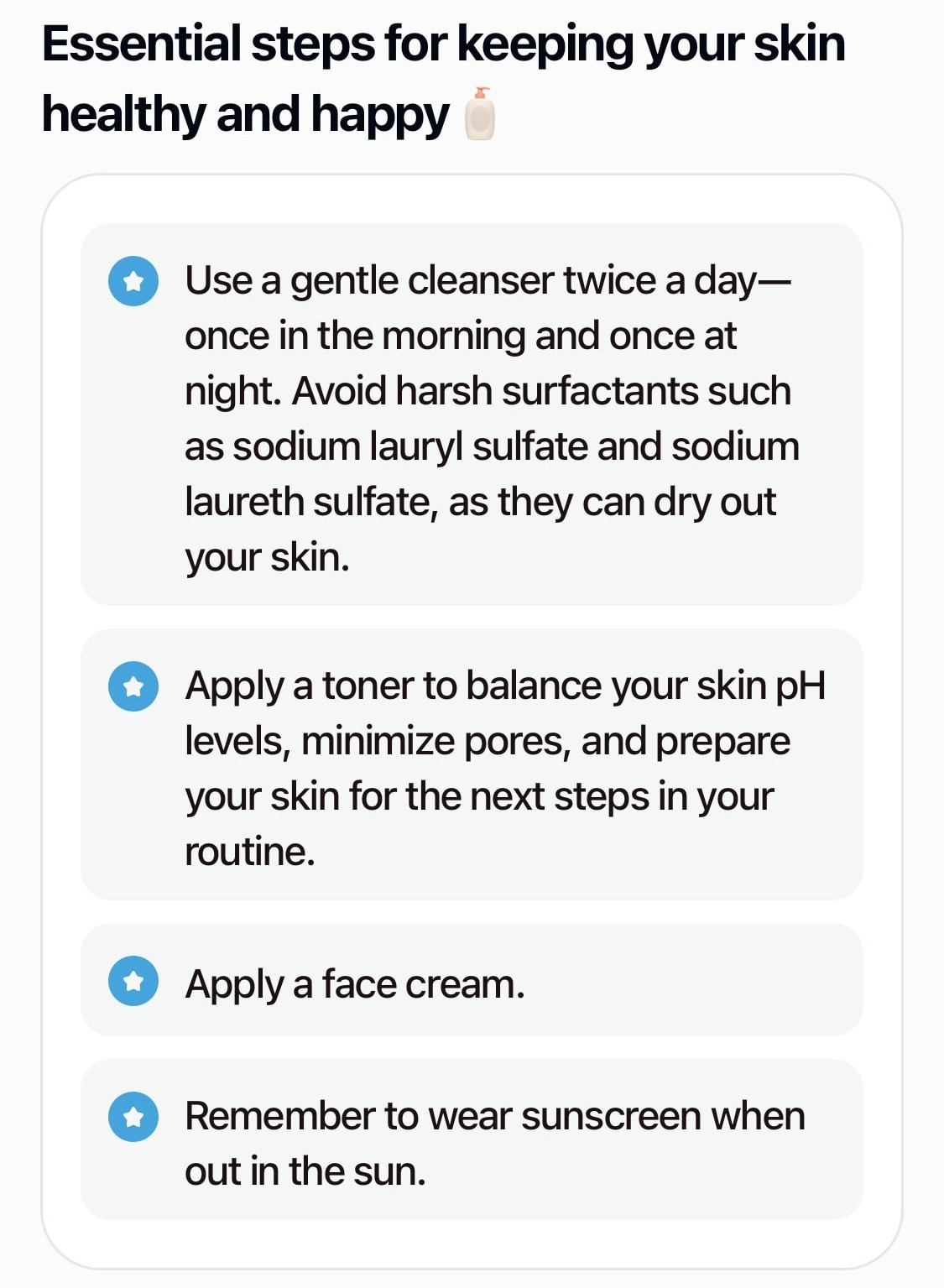
The Cosmetics App employs a sleek and modern hierarchy that reflects beauty, elegance, and trust. The hero title is set in a bold, stylish sans serif font to immediately capture attention, while the tagline is presented in a lighter, italic style to convey sophistication and personalization. Section headers are clean and consistent, ensuring clarity across features, while body text uses a neutral, highly legible font for easy reading. A soft pastel palette of blush pinks, creams, and subtle gold accents reinforces the premium cosmetic aesthetic, complemented by rounded card layouts and subtle shadows for depth. Icons such as 🔍, 🧴, and 📸 punctuate bullet points, guiding the eye and adding visual charm. Together, this hierarchy creates a polished, user‑friendly experience that feels both luxurious and approachable.