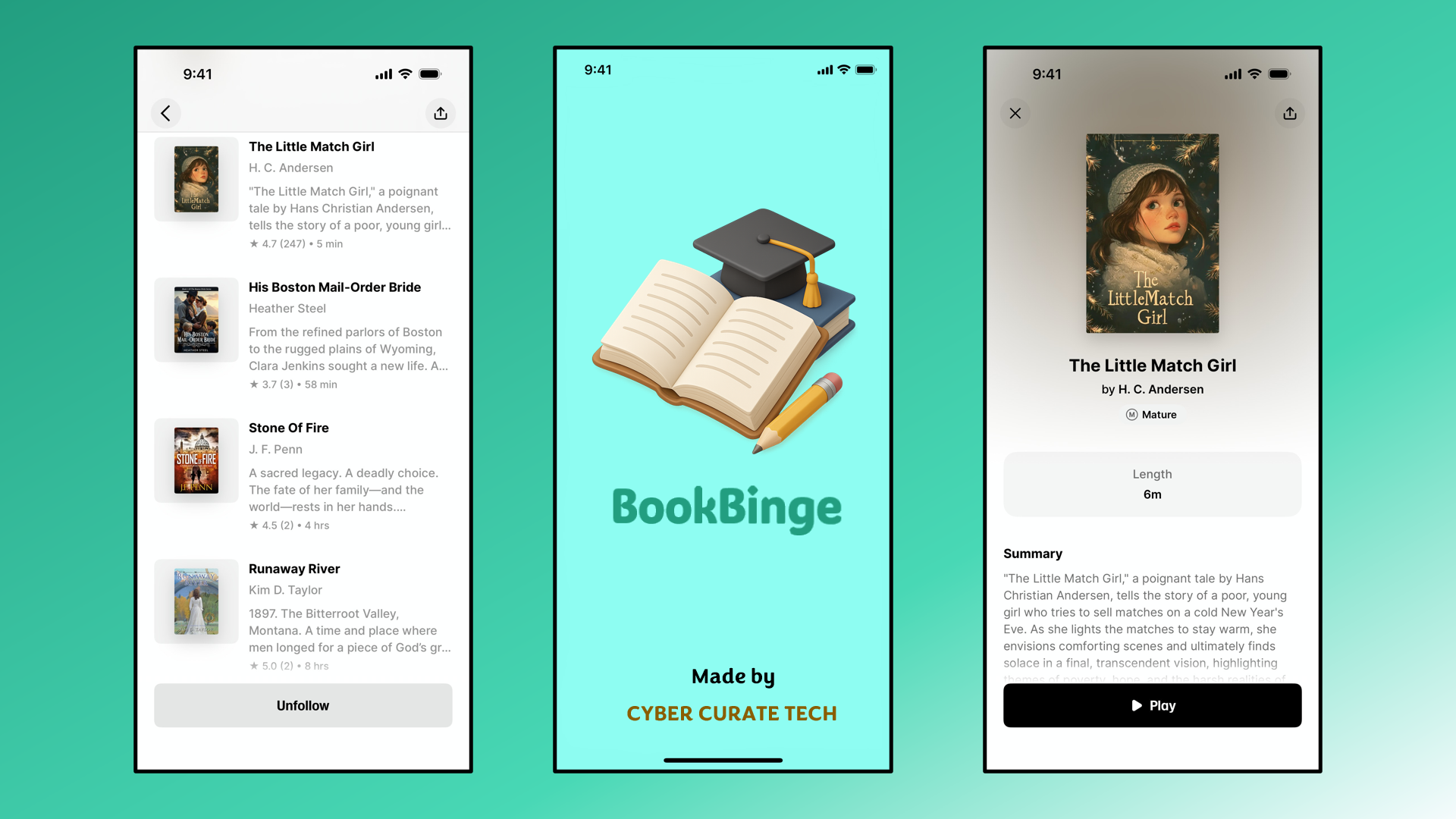
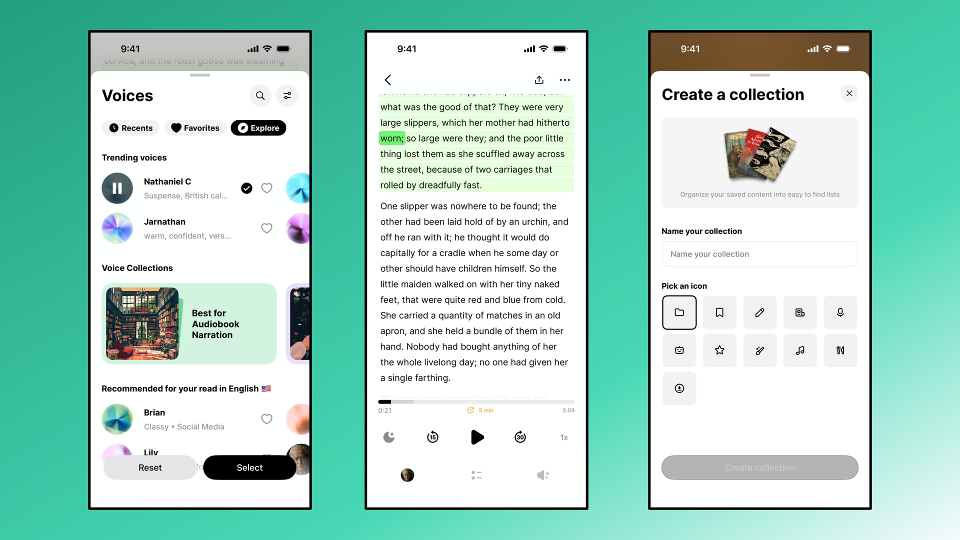
The Book Reading App employs a clean, reader‑friendly hierarchy designed to minimize distractions and maximize immersion. The hero title is set in a bold, modern serif font to evoke the tradition of literature, while the tagline uses a lighter sans serif style to convey accessibility and innovation. Section headers are consistent and medium‑weight, guiding users through features clearly, while body text is highly legible with adjustable options for user comfort. A palette of warm neutrals, soft blues, and deep charcoal creates a cozy yet professional atmosphere. Icons such as 📖, 📑, and 🎧 punctuate highlights, while card layouts and subtle shadows provide structure without overwhelming the reading experience.